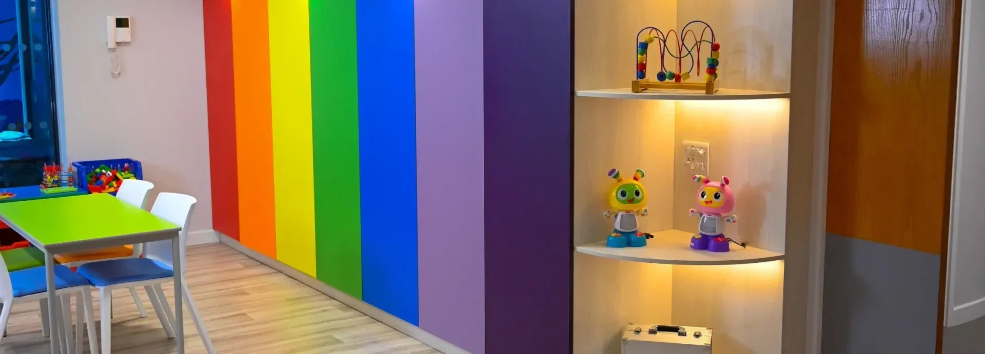
Interior design for care homes is growing in a big way. With more and more care homes opting for a luxurious feel, getting the right colour scheme can make a lot of difference.
We’ve had a chat with our interior design team and come up with useful tips that you can use when choosing colour schemes for your care home. Have a read.
The power of colour
You might not realise it, but the colour and colour schemes can have a huge impact on a person’s mood or state of mind. Rather than just plucking a load of random choices out of paint charts, you should first look at what each group of colours evoke in people and see if that matches the type of environment you want to create.
Here are some colours and moods and emotions commonly associated with them:
Red: Love, energetic, passion, heat, strength.
Orange: Joy, enthusiasm, happiness, stimulation.
Yellow: Cheerful, energy, energetic, pleasant.
Green: Ambition, nature, recovery, growth, jealousy.
Blue: Calming, intelligence, peaceful, stability.
Pink: Femininity, love, kindness, nurtured.
Purple: Royalty, luxury, wisdom, mystery.
Brown: Earth, grounded, secure, warmth.
This is a general overview of colours and how they can make people feel, but it’s worth noting that different shades of these colours can indeed evoke other feelings. You can always ask others around you what they feel and think with certain colours if you’re struggling to pin some together.
Using your signature colours
If you’re part of a care home group with its own set of signature colours, you may be inclined to use this palette throughout your new (or newly refurbished) care home. That’s absolutely fine, but you should use it conservatively.
Using the same three or four colours through an entire care home can be a bit repetitive and even disorientating for residents. To keep your care home on-brand and in-line with any other care homes you may have, we’d suggest you use your signature colours in just a few areas of the building.
This could be the reception area, the offices, and perhaps a lounge or dining area. If you use these colours in residents’ bedrooms, it can make your care home feel less cosy and more corporate.
Dementia-friendly colour schemes
One particularly interesting area of research has shown that certain colours and contrasts can help people with dementia to live more independently in care environments. For more information on how to create a dementia-friendly building.
Having different coloured light switches, door handles, and even toilet seats can help someone with dementia to recognise the object and see it more clearly to avoid confusion.
Try and avoid mixing in too many different colours for people with dementia as this can cause even more confusion. Thinking of all the different emotions colours can bring out, it’s wise to pick just one or two!
Colour schemes for care homes
Although we’ve already touched on colour schemes, it’s very important to also think about how different tones and shades of the same colour can be used in a care environment. Bearing in mind that some residents will have poor vision, using different shades of the same colour can help people to see more clearly.
One area in particular where this is very useful is a corridor. In a care home, you could have a corridor lined with doors on either side that appears to go on forever — or it appears that way to someone who has poor vision.
You can use tonal colours to outline things like doorways, skirting boards, and other features to make it easier for people to see and distinguish between different rooms and areas. For example, you might have a pale, matte sage green colour on your walls, but you could then offset that by using a glossy darker green around door frames.
Something this simple will help people to learn their way around. You can even use different colours and shades to signify different departments and areas of the building.
Interior design for care home bedrooms
Bedrooms in particular need to promote a relaxing and comfortable feel for residents. Using the right colours and even textures and soft furnishings can help someone to feel right at home in their room.
Softer textures will help people to feel more at ease and relaxed in your care. Something as simple as upholstered bed-ends could make all the difference and help your residents feel well and truly at ease.
Bedroom colour schemes should be fairly calming and neutral so that different residents can make the room their own if they want to. A neutral wall colour like magnolia can keep the room feeling light and airy, and you could even use an accent colour on one wall of the room.
This accent colour, along with other complementary tones, could then be used in furniture like a riser recliner chair, or in bed throws and cushions. Consider using a light blue or even purple to promote relaxation and calmness.
Overview
Interior design for care homes can be made easy if you determine your colour scheme before anything else. This can help guide you in choosing the right pieces of furniture like chairs, beds, and even fitted items like wardrobes and bespoke cabinetry.
If you’re looking to design or refurbish a care home and need some help or advice with where to even start, get in touch with our team for an interior design consultation.

